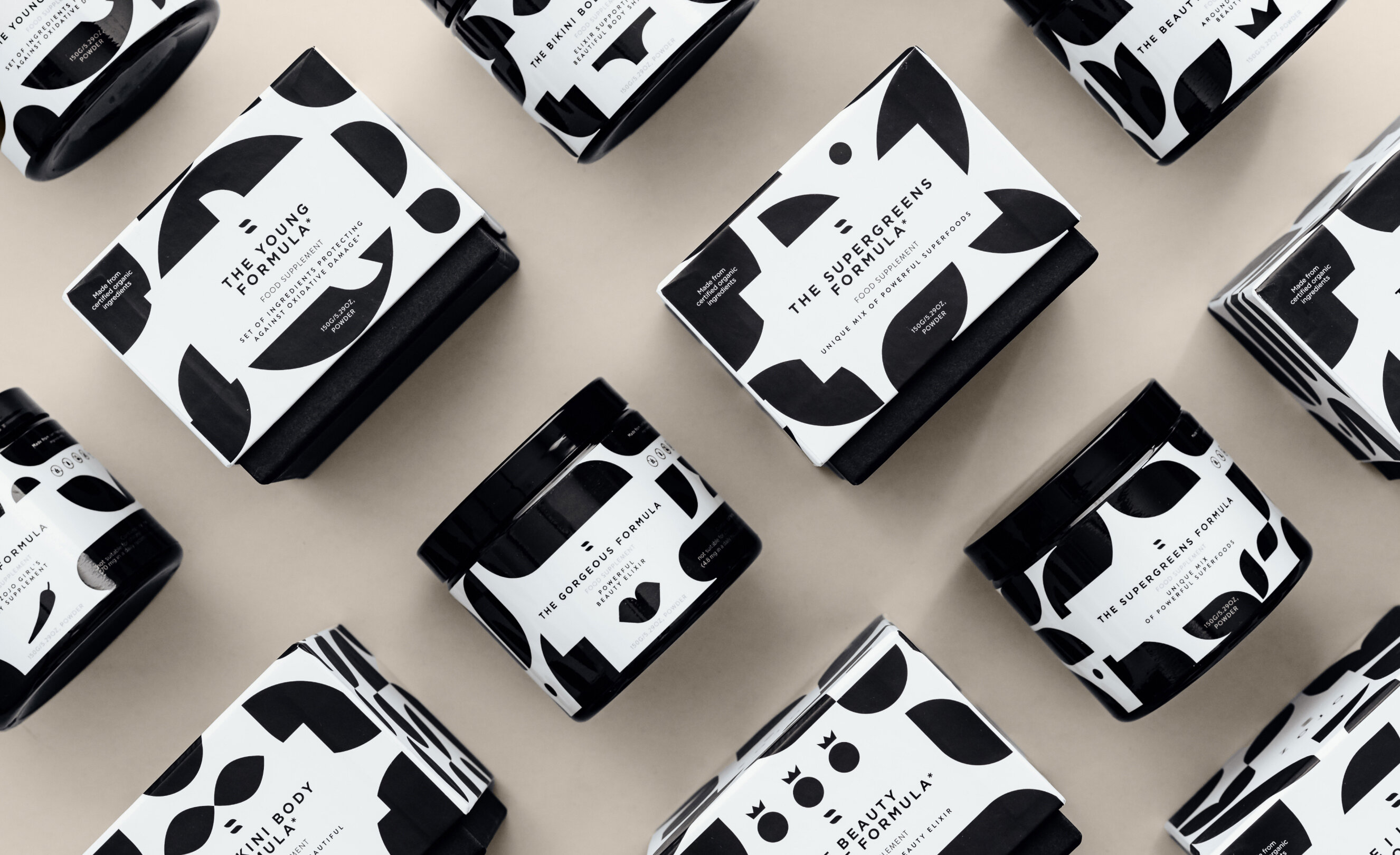
Zojo Elixirs
Supplement packaging reimagined – adding elegance to wellness

Year
- 2017-2022
Industry
- Wellness & Beauty
- Nutraceuticals
- Supplements
Tailored to varied lifestyles and needs, ZOJO Elixirs has formulated blends of natural ingredients to elevate beauty, energy, health, and well-being. We've shaped ZOJO's visual branding, and during our five-year partnership, we've brought to life 13 unique nutraceutical packages.
Scope of work
Logo
Z for Zojo
In the ZOJO logo, there's no tangle of intricate metaphors. Its design is straightforward: two gently arched shapes come together to outline the letter Z, influenced by the form of leaves, symbolising the natural essence of the ingredients.
The symbol gives off vibes of the equality sign, aligning seamlessly with the essence of ZOJO The Gorgeousness Company.
Marta Ravensdale
Key visual
Basic product line
Inspired by the brand emblem, we crafted an expansive pattern with varied yet consistently rounded shapes, evoking organic forms and feminine curves. Against a white backdrop, the black pattern's high contrast ensures it stands out and aligns easily with the symbols of individual formulas.
Strategy
Primary goals
When ZOJO Elixirs stepped onto the scene in 2018, nutraceuticals and supplements weren't the buzzing sectors they are today. Aligning ZOJO for projected sales boosts in this domain, our compass pointed towards global trends.
Premium packaging
We envisioned a design to allure the clientele of renowned perfumeries and chic concept stores, paving new, unconventional avenues for sales.
Spotlight on adaptogens
During ZOJO's early days, adaptogens resonated mainly with those dialled into natural medicine or biohacking. Our goal? Broaden that spectrum.
More than just supplements
Despite enhancing dietary values, nutraceuticals diverge from your run-of-the-mill supplements. Highlighting this divergence, especially visually, was crucial.
Nurturing habit
For supplements to yield their full benefits, consistency is vital. An appealing package not only complements any setting but also encourages daily use.
Main series symbolism
For the primary ZOJO series, we highlighted distinctive ingredients and their diverse applications. While packages maintain harmonised appearance — emphasising the series' cohesion — each blend's distinct character shines through, capturing both ZOJO's essence and the blend's uniqueness.
Expanded range
Golden Adapto Latte & Pearl
With the introduction of these products to the ZOJO range, it was essential to accentuate their distinct features. Although they adhere to ZOJO's signature colours and patterns, their exclusive designs and ingredient-centric symbols, enriched by metallic foils, set them apart.
Designing for sales
Chic ingredient, two ways
Hydrolyzed collagen had already found its place in our original lineup. Adding two new collagen variations called for a unique visual representation. The collagen and ashwagandha blend, envisioned as a pink latte, showcases a refreshed design featuring side illustrations.
Conversely, the liquid collagen seamlessly integrates into the main series, marked by its monochrome label and minimalist icon.
Printed assets
Catalogues & gift cards
In addition to product design, ZOJO Elixirs entrusted us with their gift cards and dual catalogues. Gift cards mirror the core product aesthetic in monochrome, adapting to various occasions. The extensive catalogue, celebrating the brand's debut, features over 60 icons denoting ingredients and properties. The compact version, targeting international audiences, offers translations in both English and German.
Website
Making it user-friendly
Zaprojektowaliśmy dla ZOJO Elixirs dwie strony internetowe – pierwszą na start, gdy dostępna była wyłącznie podstawowa linia produktów, a marka zbierała feedback od pierwszych klientów. Oraz drugą, gdy asortyment ZOJO był już większy, a marka bogatsza o liczne wnioski z analizy rosnącego rynku, pojawiającej się konkurencji i własnej strategii sprzedaży.
Designed for everyone
Our design ensures clarity and ease of use for both seasoned nutraceutical enthusiasts and newcomers.
Help on hand
Clear descriptions and an intuitive QUIZ lend a guiding hand to those looking for the right product.
Dish up creativity
ZOJO's powdered formulas are versatile. Our design spotlights recipe inspirations to enhance daily meals.
Highlights
Empowering brand growth
Working with ZOJO Elixirs showcases our ethos – we're not just about tasks but about forging strong business relationships. We deeply understand our client's aspirations, crafting strategies that drive measurable results.
Reliable project execution
For every ZOJO Elixirs' assignment, our precise planning and reliability ensured that product launches and marketing campaigns progressed seamlessly, backed by our unwavering support.
Industry insightfulness
Drawing from an intimate knowledge of ZOJO Elixirs' aspirations and the wellness & beauty landscape, our deliverables not only mirrored the brand's essence but were also attuned to evolving market trends and consumer preferences.
Sales-centric design
Our designs for new product unveilings captured their intrinsic value, supporting ZOJO's overarching sales narrative.
Consistent vision
Consistency defines our work, yet each project bursts with fresh creativity. With our Creative Director leading, we often surpass brand expectations. This allowed ZOJO to envision broader horizons, trusting our meticulous brand management.
