Mobipol
A new era with reenergized spirit. Bold transformation after 30 years in the motor industry.
Year
- 2021-2023
Industry
- Automotive
- Lubricants & oils
The transformation of Mobipol showcases the role of design in reshaping and reinvigorating a seasoned brand. By intertwining legacy with refreshed vitality, the new image has not only elevated Mobipol's market presence but also ignited a newfound enthusiasm throughout the team.
Scope of work

For 30 years, we have been running a highly specialised and distinctive business. We were seeking a creative executor but found much more. We are amazed by the analytical skills of the Holy Studio team, their exceptional attention to detail, and their understanding of our industry at multiple levels. They easily put themselves in our shoes, even though they had never sold oil and automotive lubricants before.

Justyna Kruczek-Miljenović
Logo
Renewed drive
The logo integrates three primary symbols: an oil droplet, the letter M, and an engine piston. These elements directly represent the industry's technical nature and highlight Mobipol's specialised services. The use of green accentuates Mobipol's commitment to eco-friendly practices, especially essential in lubricant distribution.


Strategy
Main goals
Mobipol's quest for a website unravelled a brand with vast, untapped digital promise – their profound expertise and service diversity called for a dynamic online platform.

Differentiating in a crowded market
The client's need was clear – establishing a distinct place amidst a sea of competitors. Rather than merely showcasing their link to the oil manufacturer, we focused on moulding and accentuating their unique brand identity.
Efficient information flow
Creating a seamless information structure was paramount. We designed Mobipol's website to be instinctive, transforming complex data into digestible insights.
More than just sales
Mobipol offers more than distribution – their technical mavens, fortified with advanced tools, are ever-ready for consultation. We emphasised this unique position in our design.
Renewed essence
Brands periodically seek refreshment. For Mobipol, the new site was a beacon of renewed zest, stirring inspiration and team morale.
A brand rooted in time
Our design perspective was future-forward, yet we paid homage to Mobipol's rich 30-year legacy, underscoring its heritage and foundational ethos.

Key visual
Technical clarity and lightness
The logo laid the foundation for our visual system, built on geometric, cut-off shapes. Our colour palette combines the freshness of green with simple white, grey, and black. Linear icons and isometric illustrations take inspiration from technical drawings, adding depth to the site's minimalist design. We also created two distinct icon styles: outline shapes and filled geometric forms.

Geometric influence
Angular, sharp shapes that reflect the logo's design.

Linear illustrations
Isometric graphics showcase various concepts and services.

Two icon styles
Varied icons help emphasise the most essential information.

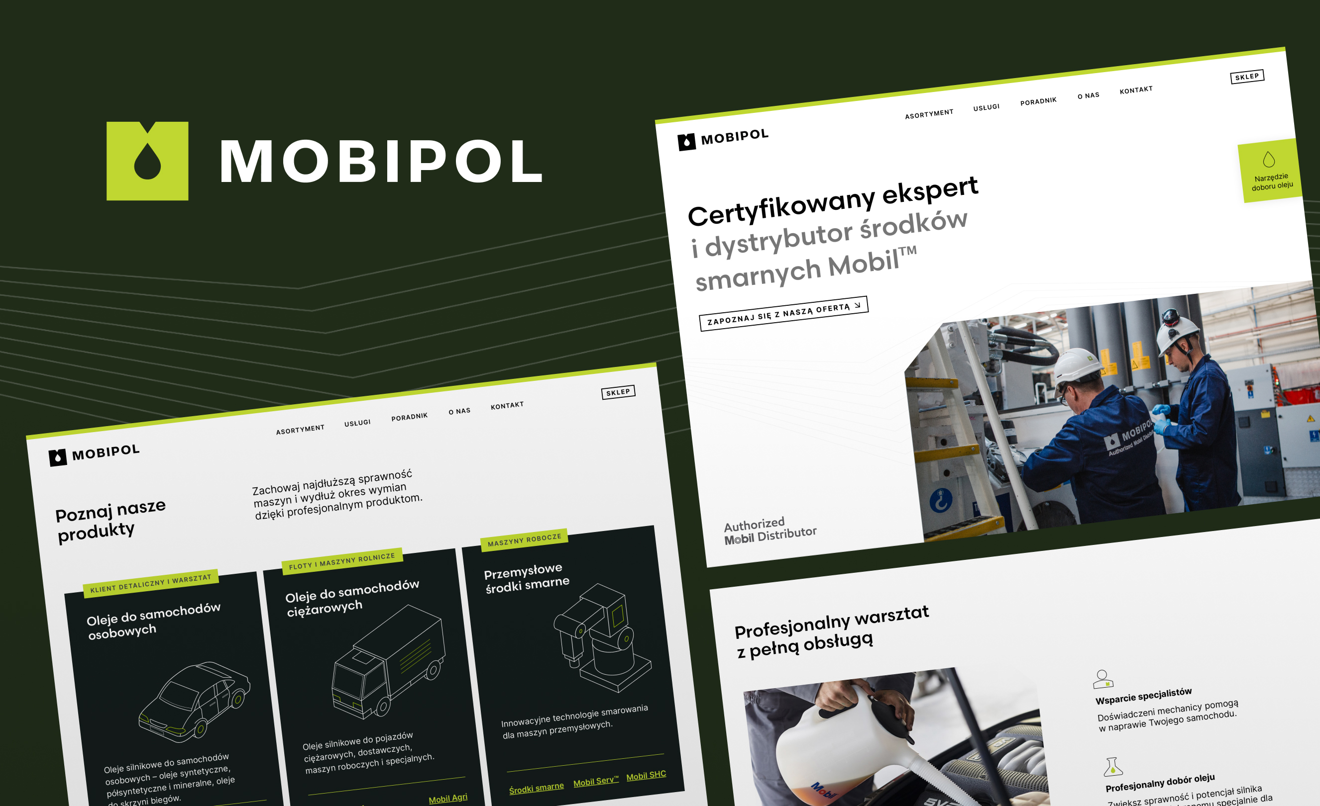
Website
Digital evolution
In designing Mobipol's website, we merged modern aesthetics with seamless responsiveness, delivering a top-tier user experience across all devices. By giving the brand a pronounced technical flair, we distinguished Mobipol from Mobil's known image, amplifying its unique identity.
Highlighting Mobipol's dedicated team deepened trust in the brand, mirroring their outstanding service. Furthermore, the specialised guides enrich the content, underscoring Mobipol's authoritative expertise.


Printed materials
Customised solutions
In crafting our printed materials, we responded to the client's current needs, from industry events to essential marketing operations. Our thoughtful prioritisation ensured the budget was directed towards aspects that enhanced the brand's reputation.


Highlights
Strategic renewal
Working with Mobipol, we gained fresh insights into the automotive world, diving deeper into the brand's characteristics. With an all-encompassing approach, we introduced solutions that strengthened Mobipol in the competitive market and unveiled new, inspiring opportunities.
Established partnership
Our rebranding efforts received acknowledgment from the product's flagship brand. As a result, Mobipol now stands out among its peers, prompting the manufacturer to continue its partnership with Mobipol, even with a shift in its strategy and fewer partner engagements.
Bridging generations
We presented a future-focused brand strategy that meets the new generation's expectations while honouring the company's longstanding traditions and commitment.
Team's new drive
Our collaboration infused new energy into Mobipol's team. They felt inspired by the renewed brand direction and vision.
Engaging new markets
Employing a strategic brand vision, Mobipol reached out to untapped customer segments, streamlining their sales cycle.
Regained interest
The reimagined brand drew back former clients, spotlighting Mobipol's renewed appeal and foundational strengths.
Through our collaboration, we've achieved a brand identity that's not only contemporary and fresh but also approachable. This positions us uniquely for future growth and fuels our passion. Entrusting Holy with upcoming projects is a no-brainer; we can focus on our core duties, confident in their dedication to excellence.


