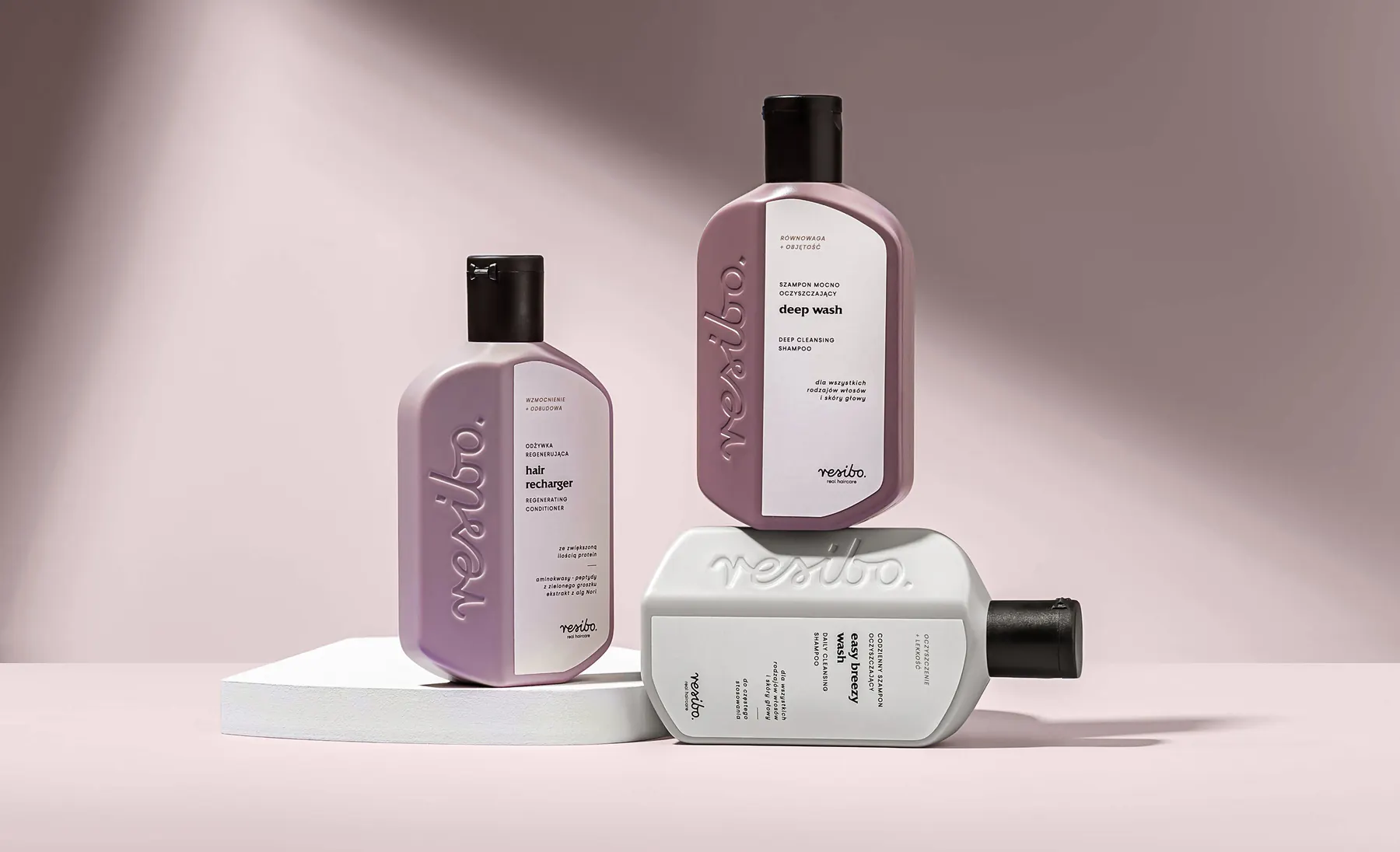
Rebranding
How we refresh a brand while protecting what customers like about it.
See how we lead a rebrandNatural cosmetics · Poland · 2020–2022
Resibo was growing fast: new products, new stores and more international markets. The old kraft packaging could no longer keep up, while some Polish customers were attached to it. Almost everything had to change without making anyone feel they had lost their brand.
“Resibo is experiencing dynamic growth; we are consistently expanding our product range and entering new international markets. Customer awareness is evolving, and many competitive products are appearing in stores. Additionally, international clients require different communication approaches, which increasingly limited our development.”

Ewelina Kwit-Betlejco-owner of Resibo
01
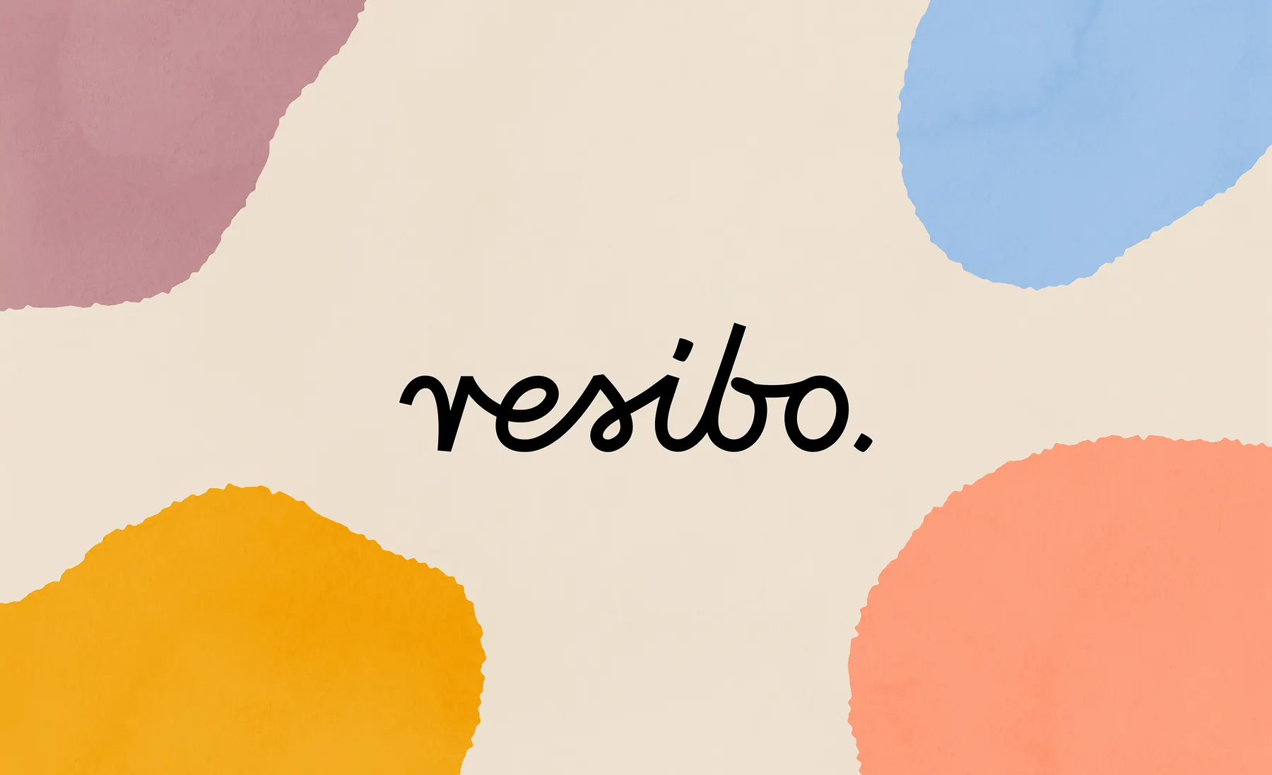
Customers knew the Resibo logo, so we kept it. We improved its legibility across the smallest pack and a large retail shelf, and moved it away from the feel of a small manufactory. A brand entering new stores and new countries should look at home there.
02
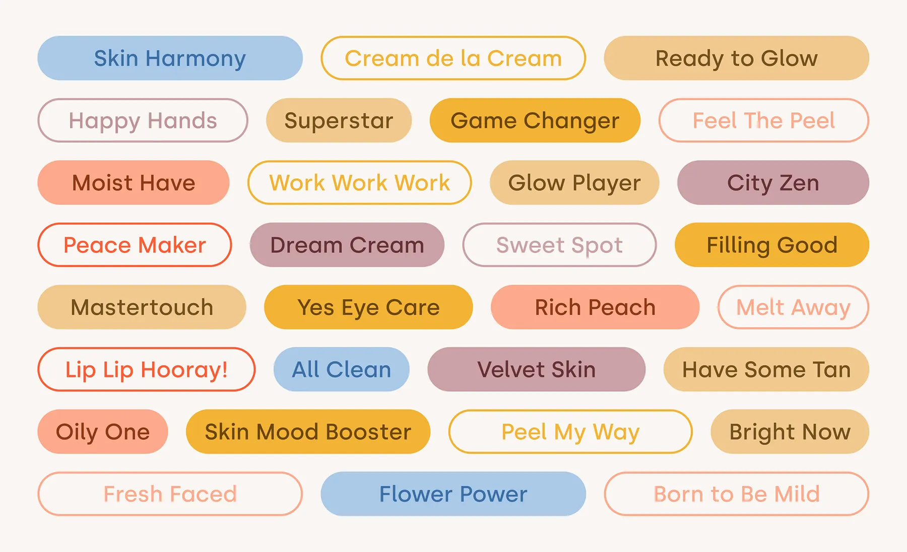
Each name is a miniature story about the product, clear without translation. We refined the functional names in both languages, so nobody has to guess what a cream is for.
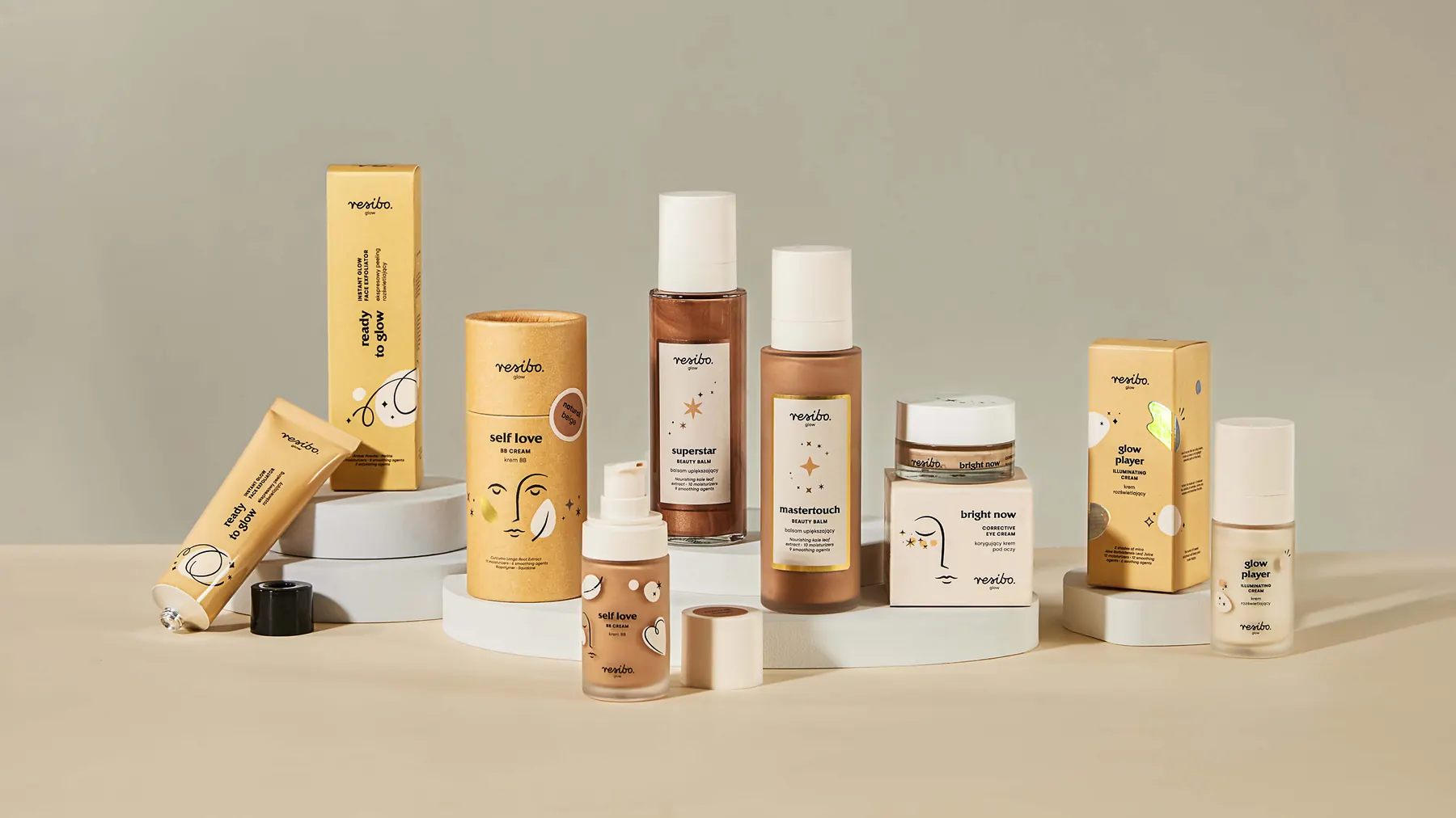
Each range got its own colour, making it easy for customers to find the one they are looking for.

03
Almost every natural skincare brand used kraft packaging at the time. It looked eco-friendly, but it made Resibo products blend into the shelf around them.
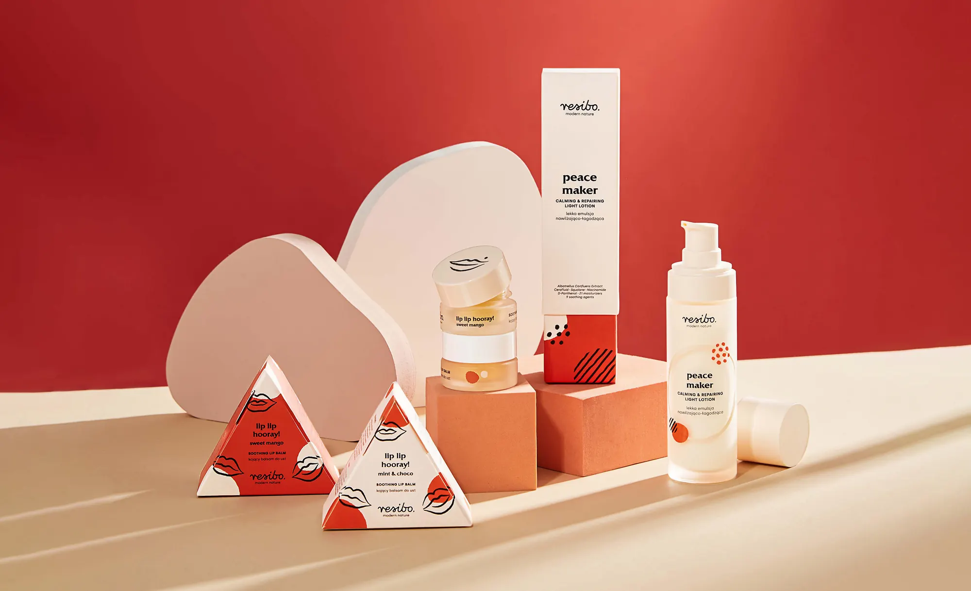
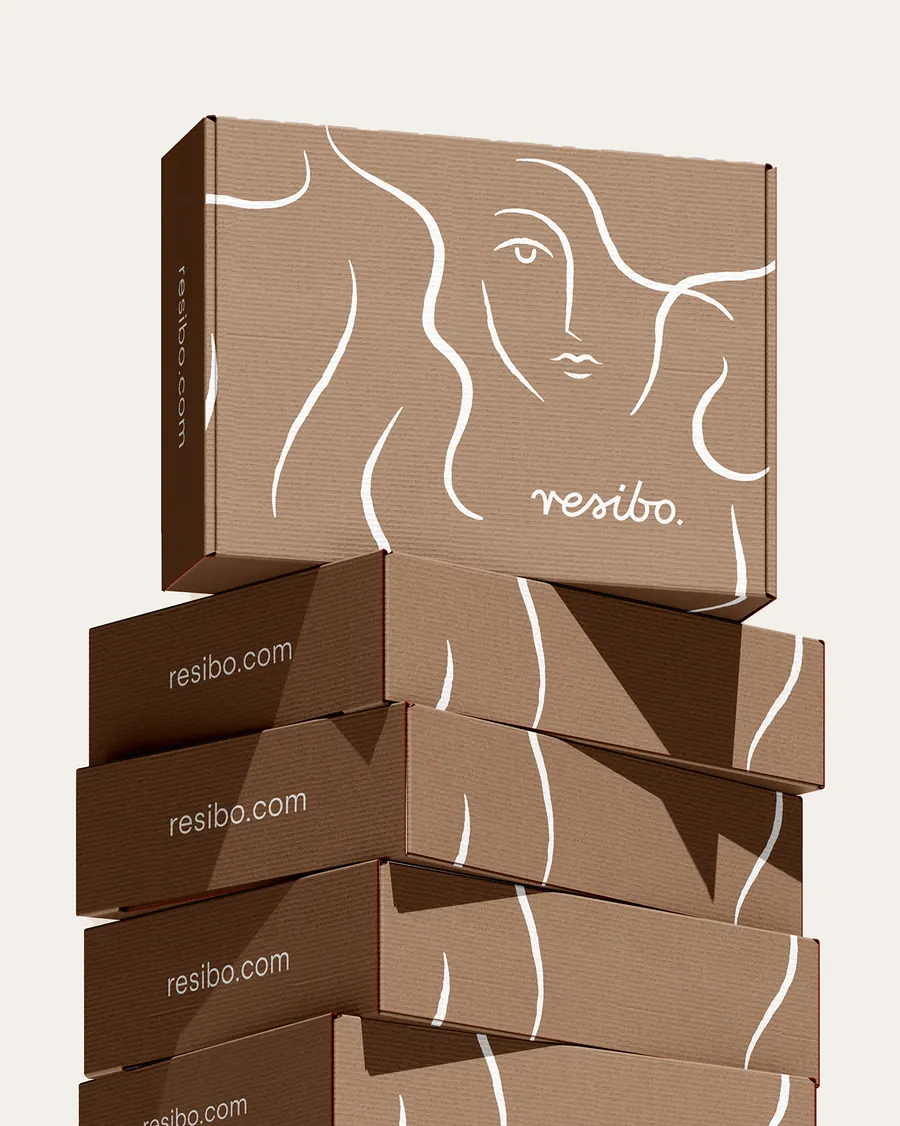
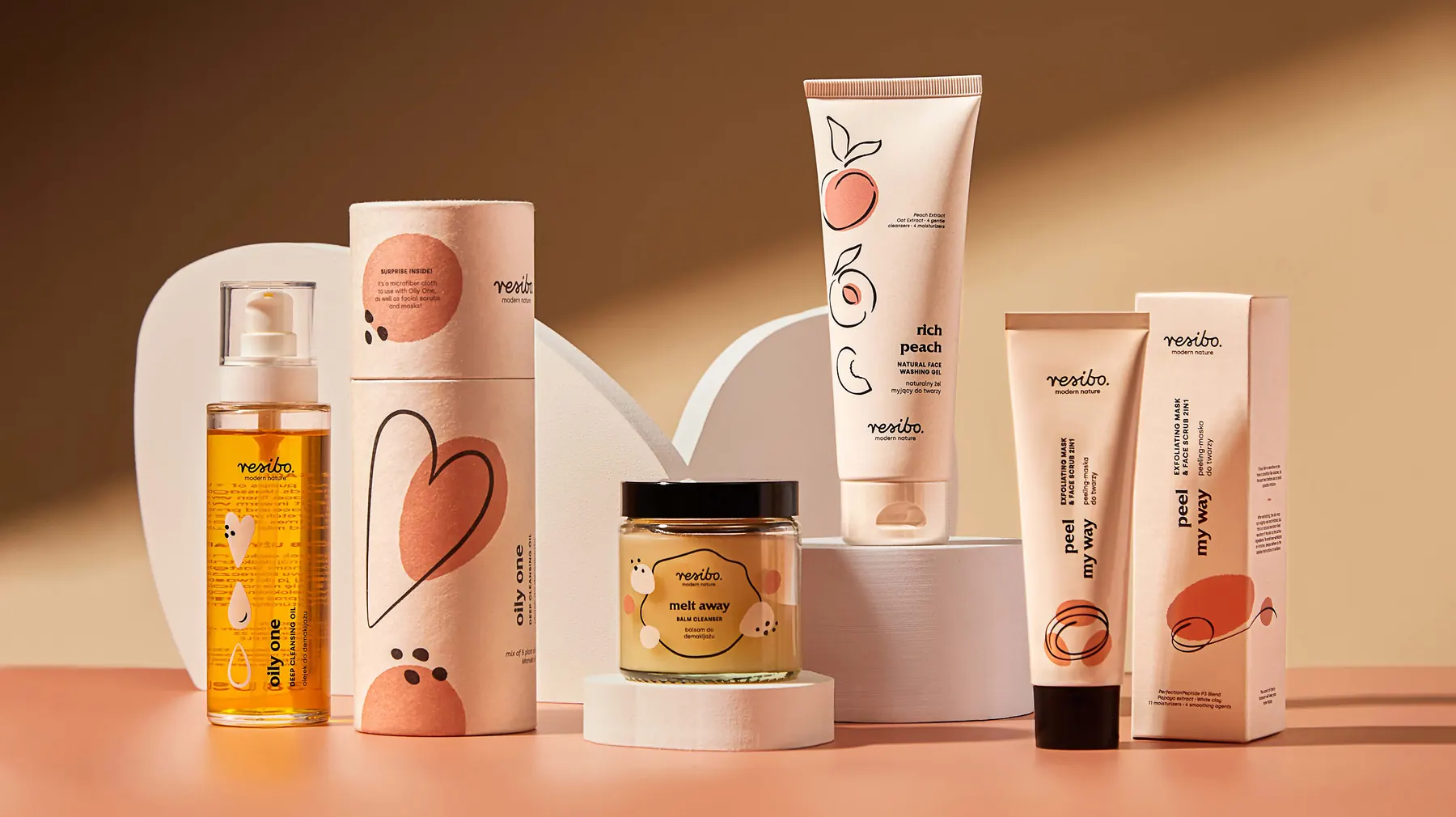
We kept what worked about kraft: its warmth and sense of a product made from nature. Then we took it in a different direction, using warm cream tones and ecological papers so Resibo no longer looked like everyone else. Different shapes replaced tubes, including triangular boxes you can spot from across the shelf.
Organic, flowing illustrations, almost like an artist’s sketch, complete the range.
04
Informed customers read the ingredients, so we gave them a prominent place. The percentage module on every pack states it clearly: 98.7% natural, 100% vegan, 100% powerful. It is a promise the brand makes on the front of the pack.

“The Holy team offered us a fresh, creative interpretation of natural skincare as an everyday pleasure and a playful self-care ritual. The designers at Holy not only addressed functional issues and met our brief but also captured the energy and spirit of my exceptional team, who passionately build this brand.”
Ewelina Kwit-Betlejco-owner of Resibo
Working together
How we refresh a brand while protecting what customers like about it.
See how we lead a rebrandThe new Hair Care line followed the rebrand.
See how Partnership worksMore projects
Resibo Hair Care · 2021–2022
A new Resibo line that sits beside its skincare range like a sibling.
Mobipol · since 2021
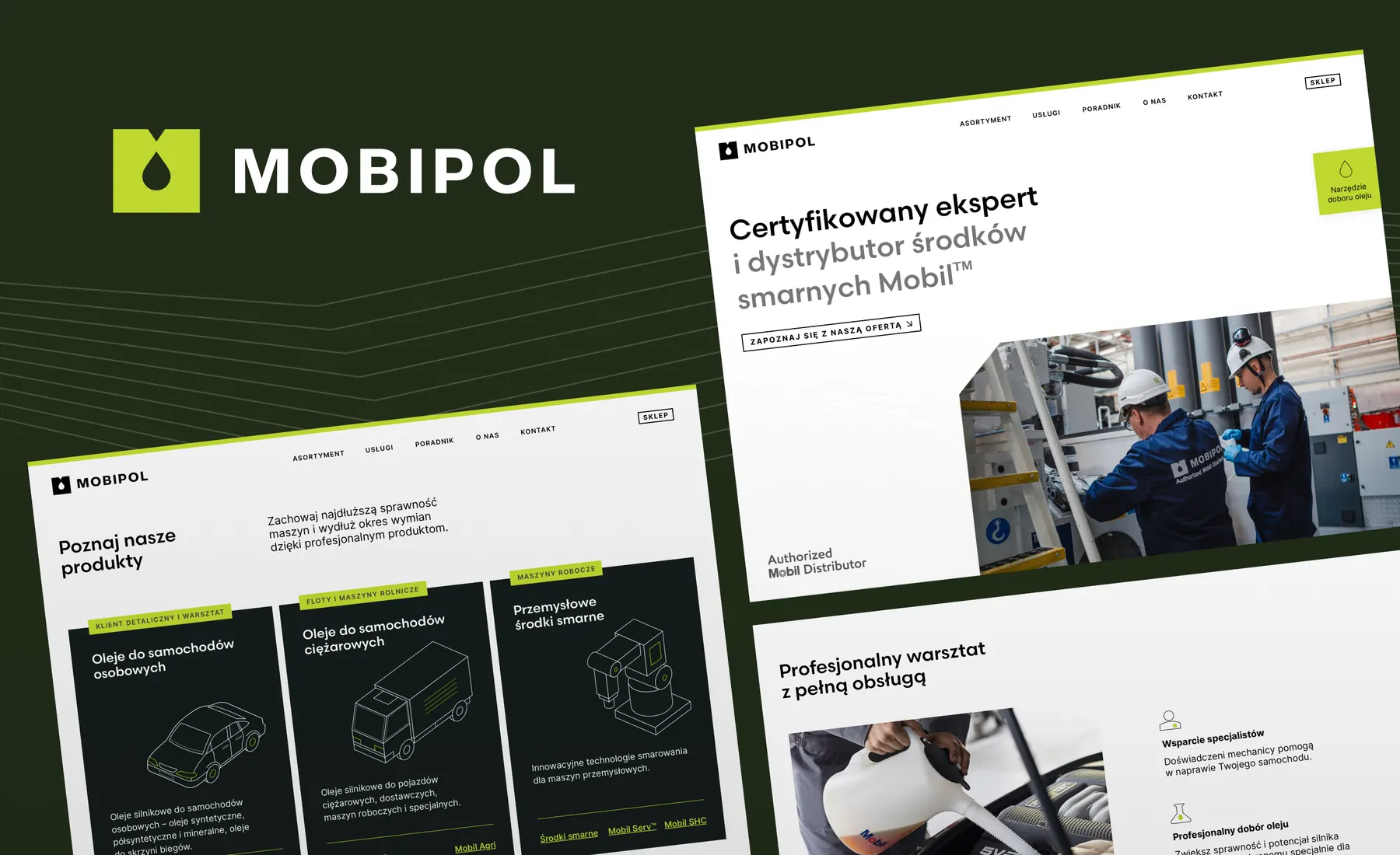
A generational change, a new identity, a website and an online shop. The manufacturer valued the rebrand and stayed with Mobipol.
Contact
Send us your website and a few lines about what you do, what is getting in the way of sales, and why you are revisiting it now. We will reply within two working days and suggest a first step.


Gabi or Piotr will reply personally. Prefer to talk? Give us a call.